Facebook unveils new look, new features
World’s biggest social network, Facebook, has unveiled a new look with all new designs and features. Facebook released the new feature on Beta and would roll it out worldwide soon. It is currently live to U.S. users while the new design is also available on desktop. The stories feature is still atop, but bolder and […]

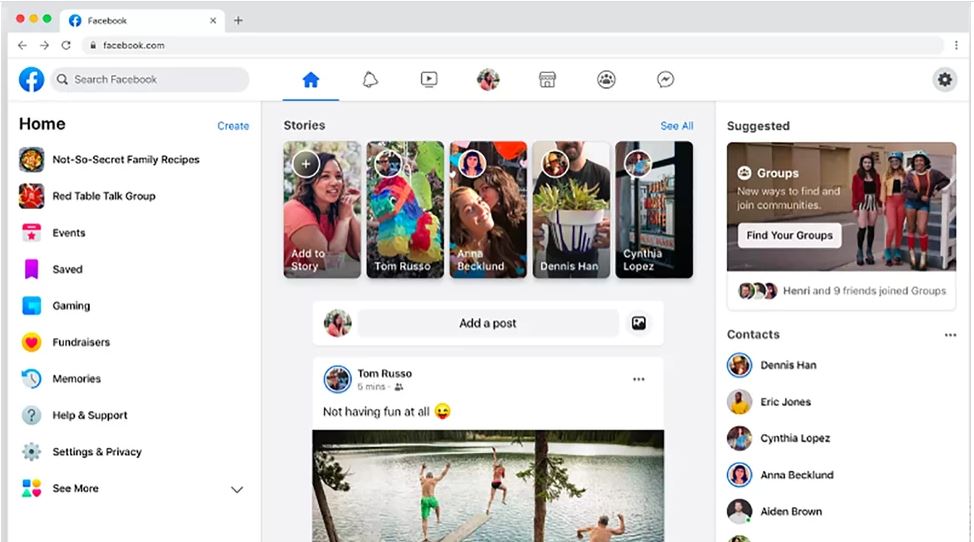
The new Facebook look.
World’s biggest social network, Facebook, has unveiled a new look with all new designs and features.
Facebook released the new feature on Beta and would roll it out worldwide soon. It is currently live to U.S. users while the new design is also available on desktop.
The stories feature is still atop, but bolder and easier to access. Photos appear bigger and better with a touch of AI.
Visually, Facebook’s redesign is carried throughout the desktop and mobile apps. It’s a cleaner, brighter, more contemporary Facebook.
At the F8 2019 conference, Facebook CEO, Mark Zuckerberg unveiled announced the social network plans to push out a massive redesign called The New Facebook. It’s an interface update that will place a bigger emphasis on Groups and Events – two of the biggest reasons people visit Facebook on a daily basis. He also introduced a new circular Facebook logo with blue background.
Facebook originally promised the redesign would begin immediately rolling out to mobile users, with desktop users to follow later.
As of January 2020, the update for desktop users is missing in action. But, according to CNET, Facebook has finally begun giving some users access to the new look on the web.
Facebook itself has confirmed it plans to offer the update “more broadly” by spring 2020.

With the latest update, Facebook users will see bigger icons for Stories on top followed by status update box. A more compact News Feed will appear next.
On the left, you will get fewer shortcuts such as Events, Gaming, Memories, Help & Support among others. This section will also have Settings & Privacy. Under the see more drop down, you can access other Facebook features.
On the right, Facebook will show suggested Groups and other suggestions followed by friends from your contacts list. The top banner will have shortcuts like Home, Profile, Notifications and others – similar to Facebook’s Android application.
It says it is also going to roll out the same white background theme to its mobile version.
Users, however, can switch between the new look and the classic version anytime they choose to.
It will be recalled that the social media giant boasts of over 2.1 billion monthly active users.
